Friday, March 14, 2014

Farm House Friday: Living Room Design

Here it is the part I've been looking forward to the most...the Interior Design step of building our farm house.  I've gone room by room and started planning details for each.  The living room has become the most thought out thus far so I wanted to share my design and inspiration for this space.

We have a very open floor plan, the entrance, living room, kitchen and dining all flow right into one another.  An open floor plan is great for entertaining and living, especially with little kids you can always keep an eye on them, however when it comes to design it has a few more challenges.  The biggest one is defining space without walls!  Walls are good, but they close a space off, ceiling treatments are another way of defining space and keeping your design open.  For example, in the kitchen the future plan is to hang reclaimed wooden beams on the ceiling, thus defining the space and setting it apart from the other spaces.

Big Open Space
Another challenge is where to stop paint colors or how to make the design flow so that each room is defined for its specific function, but doesn't compete with the designs of the other areas.  The key characteristics to a cohesive design are flooring, design style and color.  Let's begin with flooring.

Flooring

I like to start with the big choices first, or the materials that are going to cover more square footage.  For example, flooring.  The choice for us on flooring was quite simple, we wanted to maintain all hard surface floor coverings.  Like tile, wood, cork, or bamboo.  Other options might be linoleum, vinyl and even stained concrete.  Hard surface flooring reduces allergens and is great for high traffic areas, which are two reasons we chose to stick with hardwood and tile.  (I just hate the fact that you can't see what's been ground into carpet.  The unknown germs give me the hibbe jibees!)

Hardwood will cover most of the main floor, excluding the kitchen, mud room and front entrance, as well as the two bathrooms.  Now we haven't decided on pre-finished or site finished, but we have narrowed it down to two different wood species, acacia and hickory.  Both species lend a rustic vibe to our design and I believe we can't go wrong with either option.  Which, leads me to our next cohesive element, design style.

Left: Acacia  Right: Hickory

Design Style

Defining your style might be difficult and could stop your design before you even start.  It's important not to get hung up on this. Yes, it does create cohesiveness, but typically if you buy what you like and keep to a color palette you will start to see your design style develop with little effort.  DON'T OVER THINK IT!

To ease your mind, I had trouble defining my design style.  I liked so many different things and my husband seemed to like the opposite.  The husband likes rustic stuff, raw wood and log homes. While I like modern, elegant, retro and luxurious, mainly mid-century modern furniture, crystal chandeliers, elegant upholstery fabric and retro inspired wallpaper.  Initially, I was hung up on how I would combine the two that it kept me from doing anything.  (Even Designers have trouble, but it's always easier designing for other people.) Until I realized, just buy what you like and buy what he likes.

On my shopping trips I have in mind or on a list what we are looking for.  If I see something in his style and it's on the list, and it's a good price, I get it.  Then the next item I buy is my style preference. I just keep alternating keeping a mental note.  I also like to keep pictures with me of what I have bought, this helps keep it organized.

By combining elements from each style that you both really like you will create a space that fits you perfectly and speaks to your design style.  Don't be afraid, just choose what you like and it will all come together.  So, I have combined everything we love and developed our own design style:  Modern, Retro, Luxury with a Rustic Twist!   


Color Palette
A color palette is a good way to make your design cohesive.   You can achieve color flow easily by using lighter and darker shades of the same color throughout your home.  In addition, choose three or four of your favorite colors and alternate their application in different rooms.  For example, perhaps the main wall color in one room becomes the ceiling color in another.  I have chosen a color palette of four of my favorite colors: gray, turquoise, yellow and ivory or cream, some may call in beige, they are all neutrals!

The first color choice was gray!  I picked gray, because  it's a neutral that goes with a lot and I fell in love with this sectional sofa from I.O. Metro.  The upholstery is microfiber, but looks and feels like velvet.  (Know where I'm going with this?  That's right, the look of luxury for less and its kid friendly!)


Second, I chose ivory for the walls.  I chose Benjamin Moores, distant gray.  (For now that is the color, always sample paint before buying and painting the final color.)   Neutral walls will not compete with the furniture and cabinetry.  In addition, I will be applying wallpaper to some areas in the house and ivory will be a good background color.  Notice the ivory color I have chosen is a cool ivory with blue and black undertones instead of yellow and pink undertones.  Choosing hues with similar undertones create continuity.  If you love blues with black undertones, look for other colors with black undertones. 
Benjamin Moore Distant Gray

Benjamin Moore Classic Gray

The third color I chose was an accent color, actually two accent colors, yellow and turquoise.  Bold!  I know:)  However, keep in mind that all color does not have to be fully saturated, actually a room looks best with different hues, tints, and shades of color.  These two colors will be used more sparingly through accessories, wall paper, and upholstery.   

Luxury and Elegance
Upholstery Fabrics

A Touch of Modern and Retro

So we've covered rustic with flooring and we've covered luxury and elegance with the upholstery. Now to touch on modern and retro.  Modern will be integrated with smaller furniture pieces like the side table and the media console.  


Now for the retro...I took inspiration from an old quilt my mom had.  She has no idea where it came from and I remember growing up thinking this thing is hideous, but now I see the beauty!  It's made from 4 x 4 inch squares of recycled clothing, probably from the 70's and probably a lot of polyester, but the colors are great and the pattern and textures, chevron, houndstooth, tweed, polka dot and plaid to name a few, add interest.  {The picture doesn't do it justice, but I snapped it last night with my phone in really bad light, but it will due for now:)}  


From the quilt I pulled the yellow and turquoise I was talking about and went with different hues and shades for accessories.   For example, turquoise is part of the blue or the green family, so is navy blue. Thus Navy blue is represented in some accent pillows.  In addition, yellow, like the turquoise, has different shades and hues, but each color can also be metallic, in this case yellow to gold.  Gold is also luxurious.  The third pillow combines both the turquoise and gold and adds some pattern.  The zebras, well I just had to have an "animal print"!  

Some More Rustic

We have the floors that give a rustic vibe, but I wanted to add more and I came across some great inspiration for cladding our fireplace.  I want to use recycled barn wood, hopefully the wood we were able to salvage from my husband's, family's farm, to face the fireplace, much like this picture below.  I will also incorporate some wood beams.  Not only is the design rustic, but it also has modern flare demonstrated by the straight lines.    


Last But Not Least

And probably the most important for most families...the storage!  Even though we are building a new home with closets and lots of space we still need storage for everyday activities.  Displaying accessories, storing books, magazines and toys, hiding the remote, hiding the DVD's all of these things need to be taken into consideration and make a room function yet still be inviting.  Because honestly who wants to look at all that all the time?  Not me!  I designed a full wall of built-ins for our living room.  Storage for toys, movies, blankets, decorations, dog stuff, you name it it stores it!  There is also a lot of display space.  


My Design!

My Inspiration!

Full Design Plan

Floor Plan

Furniture and Accessories

There you have it...the living room in theory!  Now naturally things may change between now and the finished product. What do think?  What is your design style?  Do you know how to define it?

Happy Friday!

xoxo,
Alissa
Related Posts Plugin for WordPress, Blogger...

Tuesday, March 11, 2014

Kitchen: Before and After

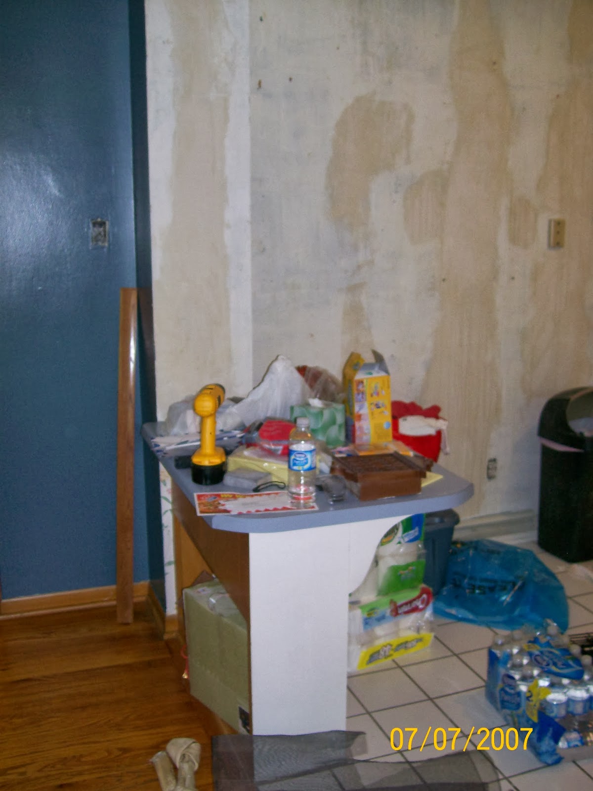
About seven years ago my husband and I bought our first home.  A quaint split-level home, on a corner lot, with a white picket fenced back yard, perfect for a dog to run and play!  The inside was in good shape, but needed some updating.  Most of the rooms took a quick layer of paint and they looked like new!  However the kitchen was a different story and it became our first project.  As you walked into the kitchen you were almost blinded by the white, white floors, white cabinets, white walls, white ceiling and white appliances.  Don't get me wrong, I love white and bright, but all this white was accented by baby blue, laminate countertops and some horrible floral wallpaper, that by the way would not come off.  (I just painted over it.  I tried to remove it, but there were layer of paint and wallpaper underneath it. It wasn't a battle I wanted to fight.  With a little quick drying joint compound, a quick sanding and priming, it was ready for paint.)

{Before}


Tacky wallpaper and white tile floor.  Oven/micro combination wall cabinet becomes a pantry. 
The stove top is moved to an island and the hood area becomes a display shelf.  Look at those countertops!
Same view, but this one shows a corner of the peninsula cabinet that was just, well plain awkward and in the way! 
Some of the wallpaper was removed, but it took F O R E V E R!  So we opted not to remove it above the cabinets.  Oh and see the carpet on the stairs,  it was removed and the stairs were refinished to natural wood tones.   
Another look at the awkward peninsula.  


I can't tell you how old these appliances were, but they were monsters and I was afraid to use them!  Moving the stove top to the island provided more counter space and we were able to install a drawer to organize cooking utensils and silverware. 
Fortunately, my husband being the master craftsman he is, was able to update our kitchen for about $12,000.

{1}
The first thing that had to go was the white floors.  You could see every spec of dirt, every food crumb, every dog hair and every spill that had dirt stuck to it.  And I cleaned it... ALL.  THE.  TIME!  My husband broke up and removed all the old floor tile (not easy, not clean and not fun).  He then laid a new porcelain tile that resembled the look of travertine.  Also removed was a peninsula cabinet/counter that was between the dining room and the kitchen.  It made sense to remove it and add an island.

{2}
Second, he constructed new cabinet faces and doors, built a kitchen island that would house our oven and stove top and retiled the entire floor.  The biggest reason we saved a lot of money was doing the work ourselves, we all know DIY is cheaper than contracted labor.  Aside from doing it all ourselves, we salvaged the "bones" of the kitchen.  Re-using the cabinet frames and refacing them was a huge savings.

{3}
Third, he built an island so that we could move the oven and stove top there.  This freed up a lot more counter space and gave us room to have a small built in pantry.

{4}
Fourth, custom cast concrete countertops (say that five times fast).  These countertops turned out amazing and it was fun to follow the whole process.  It's not a job for a beginner, but there is so much information out there about how to do it.  This saved us about $2500.  He also retrofitted our old stainless steel sink.  In the old kitchen the sink was a drop in, but we wanted an undermount.  An undermount looks prettier, is deeper and solves the problem of the scummy buildup around the sink lip.  This also saved us about $500 because we didn't have to buy a new sink.

{5}
Fifth and last, we installed a backsplash.  A combination of black slate and honed travertine laid out in a checkered pattern.  It really complimented the countertops and the cabinets.  We painted the wall a neutral, cool gray, added some wall shelves for display and a wine rack and we were back in business. We also changed out all the trim on the main level and added crown molding in the kitchen, dining room and living room.


{After}

Looking into the kitchen from the dining room.  An antique butcher block lended itself to the plan for the island.  The kitchen is L-shaped with a tall pantry off one end and the fridge anchoring the other end.  Dental molding adds the finishing touch to the new cabinets. 

Looking from the kitchen into the dining room.  We covered the old wood paneling with wall liner (much like paintable wallpaper.)  The chair rail was added to give a more traditional feel since we don't have a formal dining room.
Another view of the dining area and the custom countertops.   We love the concrete because it adds character.  If you don't like the different colors and the unevenness, than concrete probably isn't the material you want to use.  (Oh and the dog slipped in this picture.  That's Kota, our German Shorthaired Pointer/Mix)

Wow, looking back at this transformation brought back a lot of memories!  If you have any questions about what or how we did anything please ask!


Related Posts Plugin for WordPress, Blogger...

Kitchen {2}: Before and After

This kitchen remodel was more of a kitchen update.  The cabinets were in great shape, but the countertops and backsplash needed some updating.

{Before}


White Corian counter tops with an integrated apron front sink.  The old backsplash was simple, yet a little boring.

Kitchen desk also has the same Corian countertops and no backsplash.
On the other end of the kitchen is a Butler's Pantry.  This too had white Corian countertops and an old backsplash.


{Work in Progress}


{A Simple Face-Lift}

The countertops were update to Quartz, a man made, hard surface that holds up to stains and heat.  It is non-porous therefore, unlike granite, it does not have to be sealed and making it maintenance free.  The Quartz the homeowners chose has a lot of movement in it, making it look a lot like marble and granite. This is an option when purchasing granite, but it also comes in an aggregated look, or more pebble and rock patterned.  


For the backsplash we wanted to "pizazz" it up a bit!  Subway tiles are classic and easy to install. They are inexpensive and create a timeless look for any room.  We incorporated a natural stone, glass and stainless steel mosaic to give it that "pizzaz" I was talking about.  You will also notice in the third picture, the faucet was switched out for antique bronze instead of chrome.   The first picture features the Butler's pantry and has expansive countertops great for entertaining and prepping.  


Over the Butler's Pantry are three glass display cabinets.  These cabinets were updated by simply painting the inside white.  The white gives greater contrast to display and bounces more light around the kitchen.  The light fixture above the sink and the table were also changed out. 

Finally a new kitchen sink was installed with the countertops.  A stainless steel apron front, undermount sink replaced the old integrated one and the home owners replaced the old dishwasher with a new stainless steel dishwasher. The home owners also wanted to convert their existing electric stove to a gas stove.  (If you wish to do this hire a plumber they know what they are doing!)


See how small changes can make BIG impact and not break the bank?  


Related Posts Plugin for WordPress, Blogger...

Friday, March 7, 2014

Farm House Friday: Lights

A while back I did a post about lights.  I believe lights are often forgotten about in design until you realize you need something to light up the work that's been done.  Often it's the last thing that is addressed in a design, but I believe it should be one of the first things that should be planned out.

I've gained a lot of inspiration from Candice Olsen, she is great at creating lighting plans, and follows the same philosophy about light that I do, "light follows function".  Figure out what functions will take place in your space and design a lighting plan.

Like I said, I discussed the use of light in a design in my previous post about lights, so today I wanted to share some of the lights I have chosen for our little farm house.  I have to share my favorite first, the chandelier that will hang above the dining room table.  I am so excited about this light, it's actually one of the items my husband and I agreed I could splurge on!   Drum roll please…

{Dining Room Chandelier}


Calais Chandelier-Aquamarine
Is it SPECTACULAR or what?  The aquamarine color will compliment the turquoise accents in the kitchen and dining room.  I will also incorporate hues of turquoise in the living room, resulting in a design that is cohesive and flows throughout the house.

A little side bar from lights:

If you are unsure about how to incorporate color into your home design, don't fear there are lots of resources out there.  For some it comes natural, you are able to look at color and know how to incorporate and compliment your designs.  For others, color is scary so you stick to neutrals.  I'm not saying neutrals are bad, because a neutral color scheme is actually very beautiful, but you might want to branch out and try colors, only you don't know where to start.  I've found a great book by Sabrina Soto,  you've seen her on HGTV, Home Design.  Her book walks you through with a layer-by-layer approach to home design and one of the layers is choosing color.  It's a great resource to learn and walk yourself through choosing colors for your home.

{Kitchen Island Light Fixture}

Now, on to more lights for the farm house.  In the kitchen I am just drooling over this fixture that I found online.  It looks like it would cost a pretty penny, but instead of turning away from it, I am motivated to create one for myself for less!  This light fixture will not be installed until my husband has built the kitchen island, but it's always good to plan ahead, especially with electricity.  I'll post how we make it when the time comes, until then salivate over this beautiful, vintage, yet modern light fixture. It's almost like art!


{Master Bedroom}


My next favorite light for the farmhouse will be installed in the master bedroom.  There will be two, each flanking the bed, hanging over the bed side tables.  Typically you will see table lamps for task light beside a bed however, I want to capitalize on surface space and will install sconces.  This will also be a DIY project, if you want to give it a go here is the tutorial I found.  I, somehow, want to incorporate wood into this design.


{Second Bath Pendants}

Next up, second bathroom pendant lights.  That's right, pendant lights in the bathroom. Remember my lighting plan layers light, and accompanying the pendants with recessed lights provides a layering effect which enables you to turn off and on lights as you need them.  One pendant will flank each side of the vanity.


Allen + Roth 7 inch Mini Pendant Light

This is how they will be installed.


{Master Bathroom}

It feels that my luck has run out when I started searching for master bathroom lights.  There is a certain look I like and all the lights are so expensive.  In addition, I haven't found a DIY sconce tutorial that would help solve this problem.

Here is what I am looking for: Four sconces with a chrome finish, fairly large in height, since we have 10 foot ceilings, vintage or retro style all for about $30-$40 each.  My budget might be a little low, but that's what I have to work with and if I can't find them, my second option (one I don't like) will be your typical overhead vanity light.

Like this:


This is the style I like:


So, the jury is still out on what we will install in the master bathroom.

{Entryway light}

I've gone back and forth on what to do here.  Whether or not to put a light fixture in at all or what type of light fixture it should be.  I was torn because honestly nothing popped out at me as this has to be the entryway fixture unless it was expensive.  Then I found this metal globe at a flea market and ding (light bulb lights up over my head) I had an idea for a lighting project.  It would cost 1/3 of what the design retails for and it will be exactly what I want.

Here is what you will need:

Mini Pendant light kit from lowes found here- $38
Metal Globe, I found mine at a flea market- $20
Socket Cover found here.  (This is optional.  I would use it if I opted not to use a light shade)- $5
Light Shade (Can be found at your local home improvement store.  I found one here, its a clear seeded glass shade.) -$10.00

Total: $73


I have not put it together because the house has not been wired, but I will post pictures as I do it.   The pictures below were my inspiration.  Each one costing almost $200!


{Exterior Lights}

The exterior lights were the first fixture I picked.  I found them here and they instantly jumped out at me.  What was even better...the price!  $20 each!  Can't beat that.  I love the style, the finish and they are dark sky lights, meaning they cast light down instead of up in the air therefore the night sky is not littered with artificial light and you can see the stars.

We will have nine of these fixtures on the exterior of the house.


That wraps up the special light fixtures for the house.  They will be layered in with 4 inch and 6 inch recessed lights, along with task lamps, side lamps and floor lamps.

What's your favorite fixture I picked out?  Have any lighting information or favorite light you want to share?

Happy Friday

xoxo,
Alissa


Related Posts Plugin for WordPress, Blogger...

Wednesday, March 5, 2014

Placemat to Rug: DIY Rug

The other day I was at a local store just walking and window shopping.  I like to go to see what's on clearance.  Yep, that's how I shop, sale and clearance only!  This is one of my best tips to design and decorate on a budget.  (More about that later)  As I was saying I was window shopping like I always do and came across some placemats in the clearance bay.  I already have plenty of placemats, but the color and texture were similar to what I was looking for in a rug for our master bedroom.  I want two rugs, runner size to flank each side of the bed.

When I first saw the placemats I just thought that they looked nice and I wish I could find a rug like that and then I thought why not make a rug! So, I snatched up my $2.00 each placemats, 10 for a total of $20.00.  Then I headed to the sewing store for a new needle and thread.  Yep, I sewed the placemats together to make a rug.

Placemat


Rug
Mustard Yellow is the color.  I think it looks a lot like burlap or jute rugs.

Close-up of the seem. 
What I am calling the backside, but might become the front side.  A woman loves options! 

To sew the placemats together I simply used an overcast stitch and overcast presser foot.  From my limited sewing knowledge I can tell you, you probably don't need to have an overcast presser foot, but it might make it easier.  I chose a gray polyester thread for contrast as well as durability.  In able to provide more durability and ensure that the seam does not separate, I double stitched it or stitched it twice.  

I figure that if you aren't a rehearsed sewer (by no means do you have to be professional, but it does take basic skills) or if you don't have a sewing machine you can still achieve this project by using carpet tape and taping the placemats together on the back side.

I'm not sure which side I will use, but I like that I have options.  When I introduced this project to my mom she was impressed with the creativeness, but concerned that the material might not hold up to wear and tear.  The way I see it, it was a $10 rug.  If it even last a year it will be well worth it!  Also, my plan is to use it on our bedroom, which will limit the amount of traffic on it.  

Good luck with your project.  Any questions just ask!

P.S.  I have another DIY rug project up my sleeve, so hang around and it will be up soon!

xoxo, 
Alissa

Related Posts Plugin for WordPress, Blogger...

Monday, March 3, 2014

Pantone Color of the Year 2014: Radiant Orchid

Every year Pantone introduces a new color of the year.  In 2013 the Pantone color of the year was emerald which served as a symbol of growth, renewal and prosperity.  The year of 2014, Pantone introduced Radiant Orchid as the color of the year.  Radiant Orchid provokes motivation, it promotes warmth and a magic that intrigues the eye and promotes the imagination.  An invitation to innovation, Radiant Orchid provokes imagination, and encourages expanded creativity and originality.  Qualities that are much valued in society today.  

Harmoniously, pink, purple and fuchsia combine to create Radiant Orchid which inspires great confidence and emanates great joy love and health.  In fashion, it is a dazzling attention getter that makes skin radiant on both women and men.

In our interiors, we can also incorporate Radiant Orchid.  Whether it be in paint or accessories it is sure to inspire innovation and increase confidence.  It pairs well with deep greens like olive and hunter green and compliments turquoise, teal and light yellows.  The vibrant color is sure to liven up all neutrals, including beige, gray and taupe.  Radiant Orchid will re-energize your design and unify any color palette.  Play around with this color and allow it to bring an uplifting feeling to your space without being overpowering.

Radiant Orchid in Fashion:


Radiant Orchid in Interior Design:

At first I wasn't thrilled about this color, however the more I see it, the more I have begun to be motivated by it!  I'm even thinking about using it in our master bedroom design.  

Who knows maybe Radiant Orchid will inspire you to new heights!


Related Posts Plugin for WordPress, Blogger...